The Three Pillars of Writing to Good HTML & CSS
The Three Pillars of Writing to Good HTML & CSS

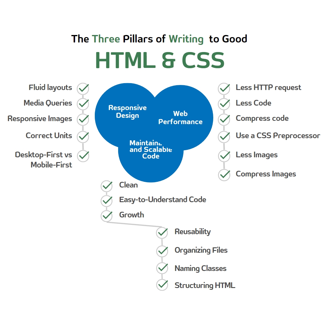
Responsive Design:-
The responsive design guarantees that a website looks and performs properly on all devices, including desktop computers and mobile phones. Fluid layouts, media queries, responsive images, accurate units, and a mobile-first approach are required to achieve a responsive design.
Fluid Layouts:-
.container {
  max-width: 100%;
  padding: 0 1rem;
  margin: 0 auto;
  display: flex;
  flex-wrap: wrap;
}
Media Queries:-
We can use media queries to apply different styles dependent on the screen size of the device. Here's an illustration of a media query.
@media (max-width: 768px) {
  .container {
    flex-direction: column;
  }
}
Responsive Images:-
Images should adjust their size based on the device's screen size. Here's an example of a responsive image
<img src="image.jpg" alt="An example image" style="max-width: 100%;">
Correct Units:-
It's essential to use relative units like em, rem, or percentages to ensure that the layout adjusts to the device's screen size. Here's an example
.container {
  padding: 1rem;
  width: 100%;
}
Desktop-First vs. Mobile-First:-
A desktop-first approach involves designing for the desktop first and then making adjustments for mobile devices. A mobile-first approach involves designing for mobile devices first and then making adjustments for desktop devices. Here's an example of a mobile-first approach
@media (min-width: 768px) {
  .container {
    width: 80%;
  }
}
Maintainable and Scalable Code
Code that is scalable and maintainable is simple to read, expand, and reuse. To create maintainable and scalable code, it's critical to properly arrange files, name classes, and structure HTML.
Clean and Easy-to-Understand:-
It's essential to write clean and easy-to-understand code that is easy to maintain and update. Here's an example
<header class="header">
  <nav class="nav">
    <ul class="nav__list">
      <li class="nav__item">
        <a href="#" class="nav__link">Home</a>
      </li>
      <li class="nav__item">
        <a href="#" class="nav__link">About</a>
      </li>
      <li class="nav__item">
        <a href="#" class="nav__link">Contact</a>
      </li>
    </ul>
  </nav>
</header>
Growth and Reusable:-
It's essential to write code that is easy to add to and reuse in other parts of the website. Here's an example
/* Shared styles */
.button {
  display: inline-block;
  padding: 1rem 2rem;
  border: none;
  border-radius: 5px;
  font-size: 1.2rem;
  font-weight: bold;
}

/* Specific styles
Web Performance
In order to guarantee a quick and effective website, web performance is essential. Here are some pointers for enhancing HTML and CSS web performance.
Less HTTP Requests:-
To reduce the number of HTTP requests, you can combine your CSS and JavaScript files into one file each. This will reduce the number of requests the browser has to make to your server, which can significantly improve your website's performance. For example:
<link rel="stylesheet" href="styles.css">
<script src="scripts.js"></script>
can be combined into:
<link rel="stylesheet" href="all.css">
<script src="all.js"></script>
Less Code:-
To reduce the amount of code on your website, you can minify your HTML, CSS, and JavaScript files. This will remove unnecessary whitespace, comments, and other elements that aren't needed for the website to function properly. Here's an example of how to minify CSS using the CSSNano tool
npm install cssnano
const cssnano = require('cssnano');
const fs = require('fs');

const input = fs.readFileSync('styles.css', 'utf8');

cssnano.process(input).then(result => {
    fs.writeFileSync('styles.min.css', result.css);
});
Compress Code:-
Compressing your code can significantly reduce its file size and improve performance. Here's an example of how to use Gzip to compress your HTML, CSS, and JavaScript files
RewriteEngine On
RewriteCond %{HTTP:Accept-encoding} gzip
RewriteCond %{REQUEST_FILENAME}\.gz -s
RewriteRule ^(.*)\.css $1\.css\.gz [QSA]
AddType "text/css" .css.gz

AddEncoding gzip .js.gz
AddType "text/javascript" .js.gz

AddEncoding gzip .html.gz
AddType "text/html" .html.gz
- Use a CSS Preprocessor:-
$primary-color: #0077cc;

a {
    color: $primary-color;
}
Use Less Images:-
Using too many images on a website can slow down its performance. Use CSS to create gradients and backgrounds instead of images wherever possible. For example:
background: linear-gradient(to right, #0077cc, #0099ff);
can replace:
background-image: url('gradient.png');
Compress Images:-
Compressing images can significantly reduce their file size and improve website performance. Use tools like Photoshop or online compressors like TinyPNG to compress images without sacrificing their quality. For example, here's how to use TinyPNG to compress an image:
const tinify = require('tinify');
const fs = require('fs');

tinify.key = "YOUR_API_KEY";

const source = tinify.fromFile('image.png');
source.toFile('image-compressed.png');
Conclusion, in The world of web development, three pillars stand tall: Responsive Design, Maintainable and Scalable Code, and Web Performance. Master these pillars and you’ll be able to craft websites that dazzle the eye, delight the user, and deliver lightning-fast performance. So take these tips to heart and let your skills soar to new heights!