The Anatomy of Typography

Typography has a special place in the world of design, and it can dramatically impact the way design fields look. It can make a design look busy or clean, or it can be the design itself. Understanding the anatomy and structure of typography can help you understand design better.
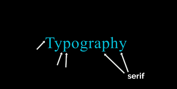
This font is serif. This is because the small brackets at the end of the characters tell us this. And each letter in this word is referred to as a character. If you draw a line that hugs the bottom of each letter, excluding the little tails known as descenders, you would get

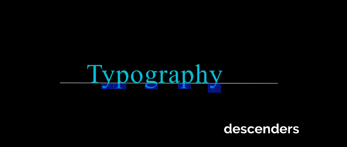
This is referred to as your baseline. You can also draw a line across the top of these characters that excludes the ascenders and this small area right here. After that, you can create your second baseline.
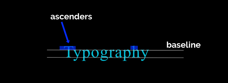
Between these two lines is the essence of your word or character. the very heart of your word or character This can help you find balance in your personality type.
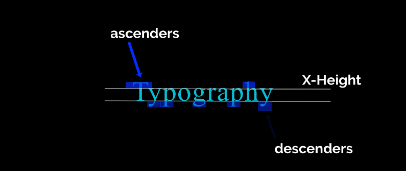
You might come across more ascending than descending characters. And this realization can assist you in determining how to balance this type in a headline or a logo.
The ascent line is the line that can be drawn at the top on the tip top of your ascenders. The descent line is the line that could be drawn across the bottom of your descenders. So hopefully that is simple to remember. With a really good font, you'll be able to draw these nice ascending and descending lines across the top and the bottom. But not all fonts or typefaces work that way.
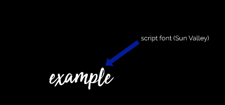
However, not all fonts or typefaces work in this manner. Script fonts, like this one, do not always adhere to this neatly lined pattern. Let's go over some basic typography terminology now.
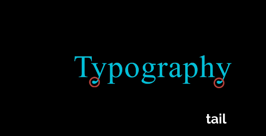
The character's very tip is the tail. The descender region, which comprises the bottom half, is currently known. The character's tail is merely its very tip.
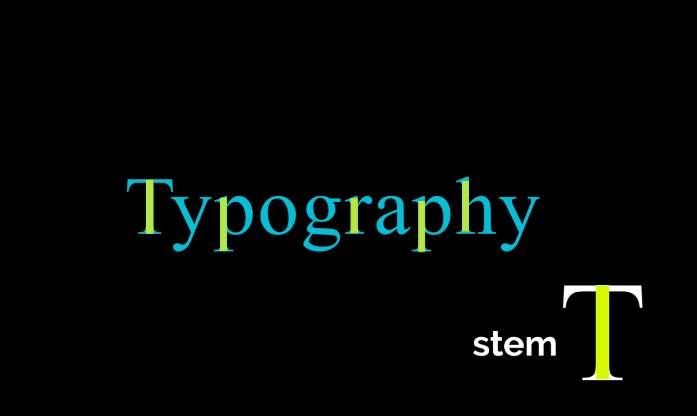
This is an example of the stem of the character.
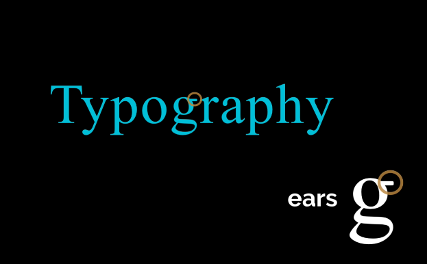
Anything that extends outside of the character is considered to have ears ars, as in this case with the g. Fortunately, a lot of typography terminology is named after parts of the human body. As you would have guessed, this is a beautiful illustration of a shoulder. There are several loops in certain typeface characters.
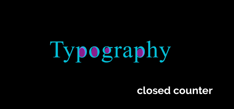
A closed counter is anything that is entirely closed inside of a character.
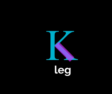
This is an illustration of how two stems are connected by character leg crossbars.
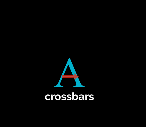
For instance, this A contains hundreds of different vocabulary words and terms that describe the anatomy of typography. Although you won't learn or need to know them all, it's still beneficial to be familiar with some of the fundamental words.
That implies having a fundamental understanding of some concepts is great, but you don't have to be familiar with every term and memorize it. Studying how type interacts with other characters' words, colors, and designs to create cohesive, balanced overall compositions is crucial. I'll go over a few terms that everyone who works in graphic design needs to be familiar with. These words and phrases are frequently used in client emails and any professional feedback you may get.
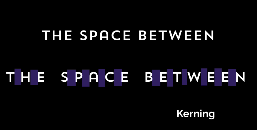
Kerning is the manual void that has been put between each character. A natural kerning has been introduced to each font. The term "kerning" refers to manually adjusting the character spacing using the software that we'll be utilizing in class. For instance, when designing logos, I always attempt to manually kern type the characters because even the smallest changes can have a significant effect on how it appears. Fonts' default spacing isn't always ideal. Additionally, kerning can balance the logo by altering the amount of space between characters. Your design's type can be improved by tucking that letter in to eliminate the extra whitespace. When creating logos and headlines, I enjoy experimenting with various font styles.
Some fonts really suit the lovely seraph, tail, and loop I'm going for.
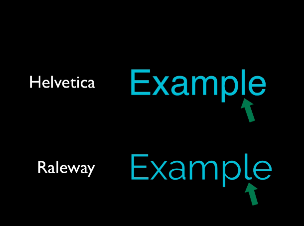
But consider these typefaces as an example. Observe how they appear to be relatively similar at first glance, but when you zoom in and check for the minute details, they differ considerably.
The term "letting" refers to the space between sentences or phrases. The space between sentences and a long paragraph can significantly alter how a block of type looks and feels. It can seem quite tidy to use larger spacing or allow between sentences. More compact spacing can seem somewhat crowded. Learn how to manually space and balance logos, headlines, and custom lettering when learning intermediate or advanced design techniques. Tighten the space between characters or words when working on headlines or type. It seems to work best if you look for opportunities to insert words and characters into nice, white spaces, almost like a puzzle piece We can complete this quickly. Having a good custom-fitted style to your typography goes a long way in making it look professional in Adobe Illustrator when your major headline and phrase are the biggest emphasis of your design.
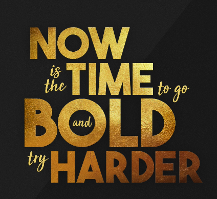
Additionally, using a variety of font styles and types in a single headline is a good idea. So in this instance, italicizing the less significant ones, making them smaller, and combining them with a lovely script font and this sans serif font all work really well together. Additionally, incorporating words and minimizing the amount of white space between the characters and letters gives the impression that the design is more cohesive.
In terms of branding and logo design, personalized lettering is crucial. Using a script font can be tricky, but if you don't like the way it looks with the first capital letter, you can always switch to a different script font and use that instead.
Thank you for reading!