
Color theory is the art and science of selecting the best color palette for your website.
Take a look at this example..
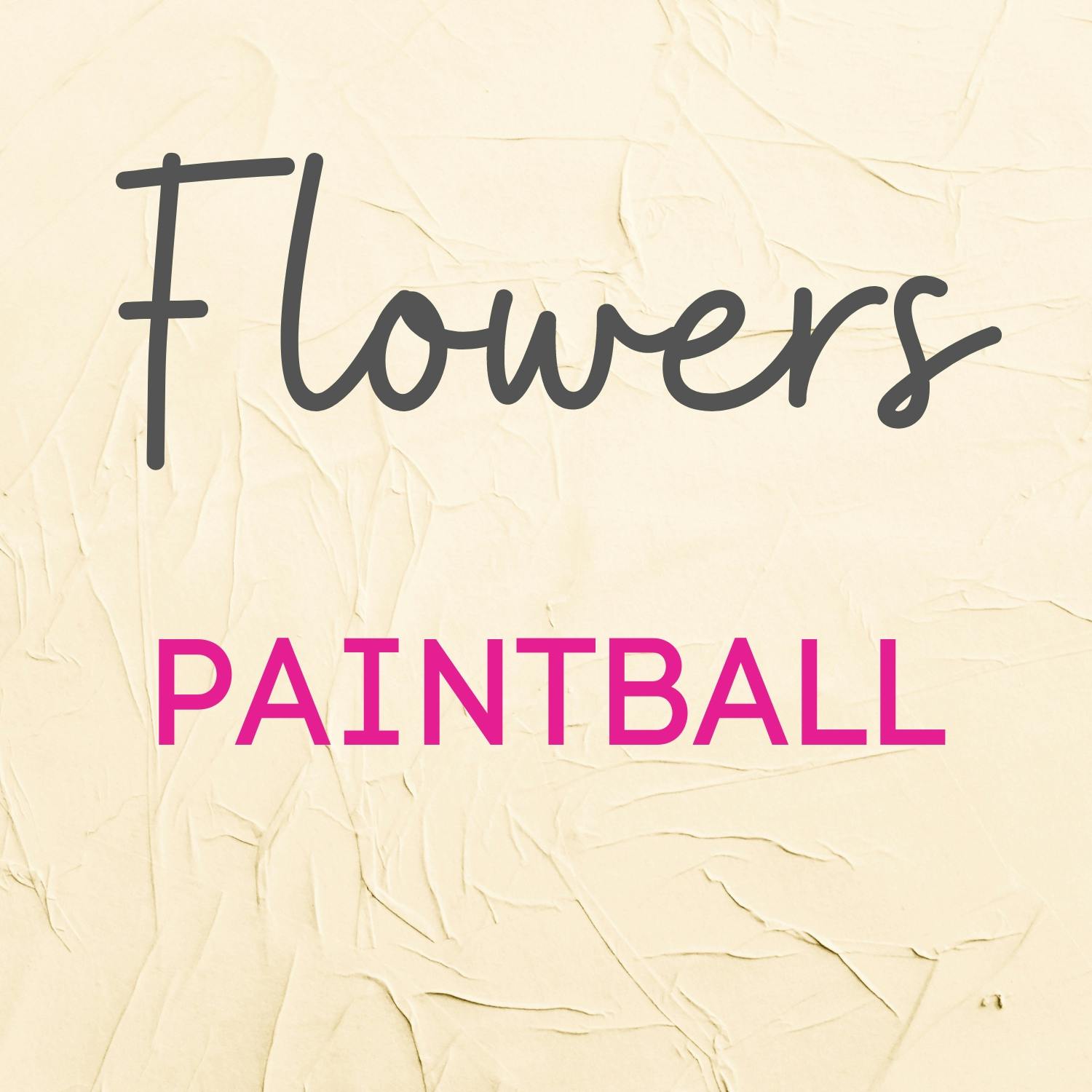
Assume you have a logo that includes brown flowers and pink paintballs. Everything appears to be strange and inconsistent. Take a look at the actual logos as well. What do you think when you see these color palettes on the words, for example? The color of the flowers resembles dirt while also resembling something else. The paintball is also pink.
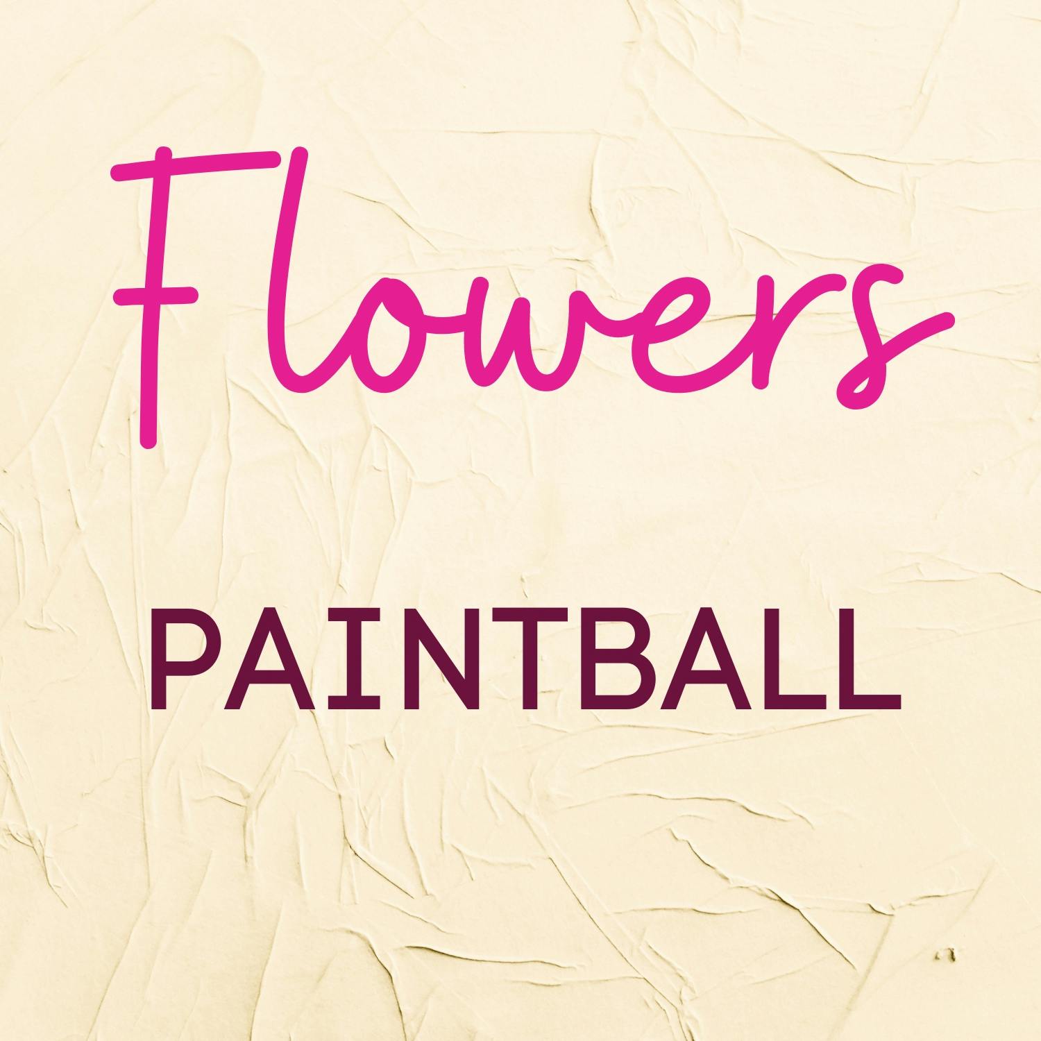
Examine this out, When we change the color palette, everything seems to fall into place. Isn't everything looking a lot better now? It appears to be consistent with the actual message.
So, when choosing colors, keep the mood of your color palette in mind. As an example, the dominant color that will be used in your design tells a story and conveys a message to the user.
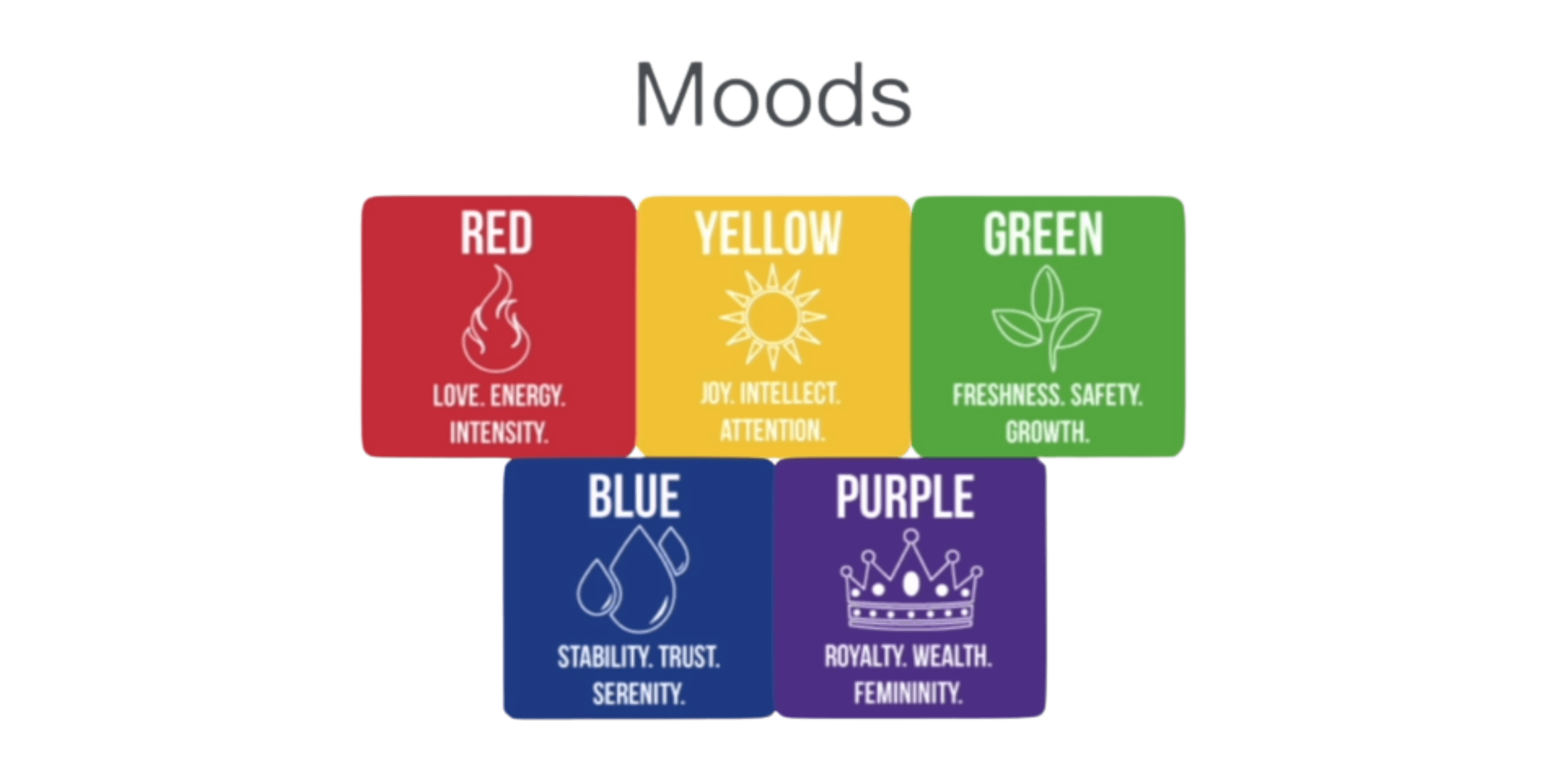
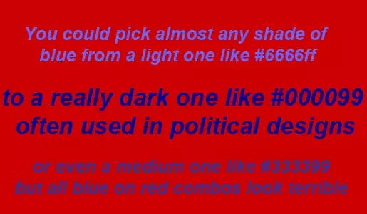
Red
Red, for example, represents love, energy, and intensity. This is why you see so many car advertisements with a red car on a red background. It's because they're attempting to convey to you,
"Buy this car, and even if you're 89, you'll feel energetic and the intensity of this car."

Yellow
Yellow is associated with happiness, intelligence, and focus. The most important aspect of yellow is its ability to draw attention because it is nearly impossible to ignore something that is bright yellow. Why is it causing such outrage and attracting so much attention? And I believe the reason is that it is bright yellow. When you see this advertisement, you can't help but notice it. So, when it comes to creating a logo or a headline, yellow is an excellent choice. However, when designing something that will be looked at for an extended period of time, yellow can be overpowering. If you tried to read an entire article with a yellow background, you might hurt your user's eyes.
Green
Green represents newness, growth, and security. As a result, many grocery companies, such as Hello Fresh or Amazon Groceries, use this color as their primary color palette. Because it is attempting to communicate with you, "Take a look! This thing can be eaten. This is what we are offering." As a result, if your company has anything to do with food, this is usually a safe bet to go with.
Blue
Blue is associated with stability, trust, and serenity. As a result, you see a lot of businesses that need to convey that.
Use this color to say, "Hey, we're really trustworthy." Consider all of the financial companies, such as PayPal, or cryptocurrency companies such as Coinbase. They all chose this color because they want you to know they aren't going to steal your money. In fact, there was a fascinating psychology study in which interviewees who wore different colored shirts were compared. So, for example, one group would wear a green shirt, while another would wear a blue shirt, and they would compare how they were perceived by the interviewers. And it demonstrated that simply changing the color of your shirt to blue increases the amount of trust placed in you by others. So keep that in mind the next time you go for an interview.
Purple
purple is a color that represents royalty, wealth, and femininity. And, strangely, payday loan companies that use this color palette, particularly those aimed at women. The important thing to remember is that when you choose a color palette, you are making a conscious decision. It's not just about picking a color that you like or your favorite color. However, it is more about determining 'what message am I trying to convey to the user' and then selecting an appropriate color.
Typically, you will not be using a single color for your design. You'll most likely be using two or three. So, at some point, you must consider which colors to combine. This is most likely the most scientific aspect of color theory. Designers will increasingly rely on scientific color combinations. Consider two colors that are next to each other on the color wheel.
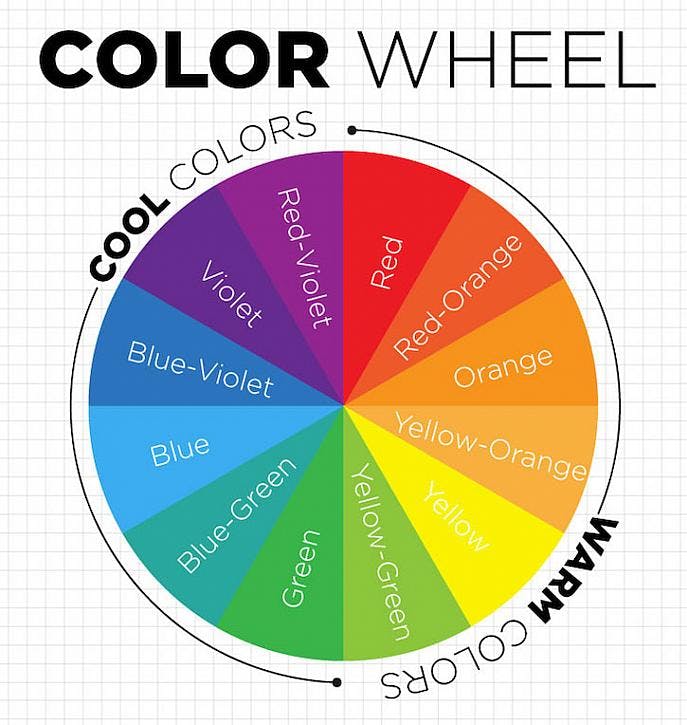
This results in what is known as an analogous color palette. And these designs appear to be extremely harmonious and to work extremely well together. So this color palette is ideal for things like navigation bars and the body of your website, as well as logos and their backgrounds. What it isn't so good at, however, is standing out. If you really want your design to stand out, use two colors from opposite ends of the color wheel to create a complementary color palette or a clashing palette. This complementary color palette adds a lot of pop. And it brings out all of the colors.
What you shouldn't do with clashing or complementary colors is try to style text and text backgrounds with them because it looks very jarring and your eyes get a little fuzzy looking at this particular combination. So, when it comes to text, avoid doing this. Instead, limit it to things like logos or icons that you really want to stand out from the crowd.
There are numerous other methods for combining colors, such as drawing an equilateral triangle to create a triadic color palette or drawing a perfect square. If you want, you can go to a website called Adobe Color and experiment with all of these different color combinations. So choose a triadic color palette or a square color palette and then drag it around the color wheel to get different color combinations. And once you've found a palette that fits the mood of your project, you can simply copy the hex codes and paste them into your website.
You can also use the website colorhunt.co. This is a website where professional designers have curated some of their favorite color palettes, and the hex codes can be obtained directly from the website. So, look at the most popular and trending sections of this website and use them to guide the pilot scheme for your next project.
When designing your website, make sure it is consistent with what your brand and product are about, and that it conveys the message you want to convey.
Thank you for reading!